

⛾ Teachers are the Ultimate Creators & Apple Wants a Bite of that Market
Diving into Apple's Canva competitor, “Apple Creator Studio”

Warning: What lies ahead are some practices that educators should never do when using AI, and should be taken solely for educational and entertainment purposes. Love with your heart, use your head for everything else.
Taking control of my lesson materials has become a core tenant of mine in my journey to use technology to maximize my capacity as an educator. This last year, I have been getting my materials off the cloud, and making them into tangible file formats that I have the freedom to do anything with1, and not beholden to the all-mighty EdTech gods who can shutter on a whim. And when Apple announced their Creator Studio this past January, I was greatly intrigued. My dream would be to get the deluge of content that Canva offers, in an offline file format that works and cannot be taken away against my will.
The subscription-based suite of apps comprises of the premium versions of the free productivity software Keynote, Pages, Numbers, and Freeform, as well as paid professional-level creative software Final Cut Pro (with companions Motion & Compressor), Logic Pro, Pixelmator, and MainStage. It is Apple’s clear attempt to compete with Adobe’s (horribly expensive) Creative Cloud as well as (free for educators) Canva.
For a bundle with educator pricing2 at $29.99 a year (which to my dismay upon purchase does not include primary/secondary educators), the professional-level software is a steal. However, here I want to examine the productivity apps that directly compete for education users that Canva would otherwise occupy. So, here is what I’ve been mucking about with from the perspective of an educator, and how it influences student experience and teacher workflow.
We Few Templates
One of the more precarious aspects of this suite are the premium templates. Hiding these behind a paywall almost indicates that free users will forever and always get the short end of the stick for software that has historically been neglected, and may never get another significant update in the aftermath of this release. This would be incredibly frustrating if the premium templates given were not so sparse, general, or poorly thought through.
Numbers
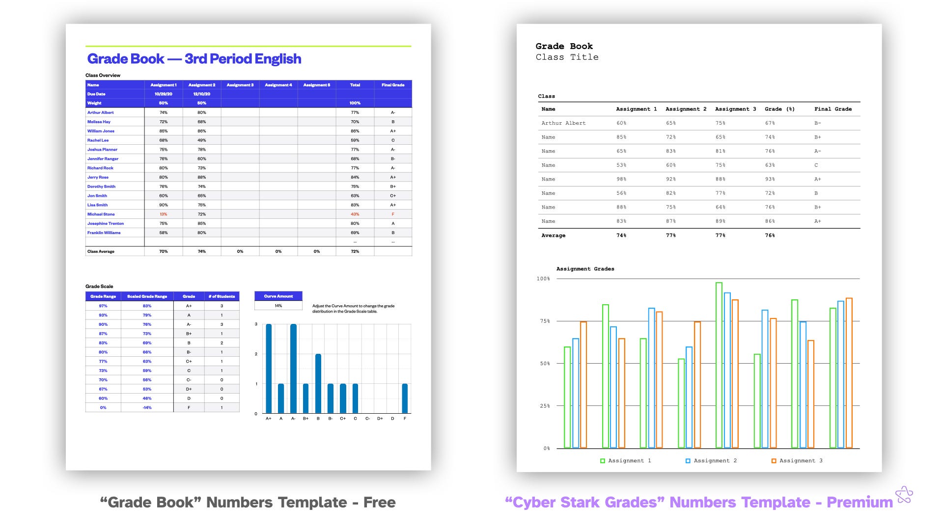
Numbers gives only six to templates to choose from, of which the most emblematic example is the gradebook. Take a look at the free and premium gradebooks side-by-side. If you squint your eyes looking at both, the differences are nearly negligible. At a glance, the table at the top has a near identical format with names and assignment percentage, and both have graphs below. But what is fascinating is that the free version actually has better and more relevant information overall. It’s graph, for example, shows a grade distribution for the entire class, which quickly gives the teacher the ability to see how they’re doing overall. The premium version swaps this information out for a graph that information information as the table above it, but with no labels. I am hard pressed to think of a situation where I would want numerical information shown visually without units, when I have the information literally right above in a more readable format. These rehashes are frequent in Numbers and it is so disappointing. They offer nothing particularly new, relevant, or niche for a group of people who are likely subscribing for a power user experience. There are so many other simple spreadsheets that could have been provided that dive deeper into the needs of students and teachers. One of the free templates is a bespoke probability calculator; You’re telling me Apple could not provide niche spreadsheets dedicated to education subscribers?
Keynote
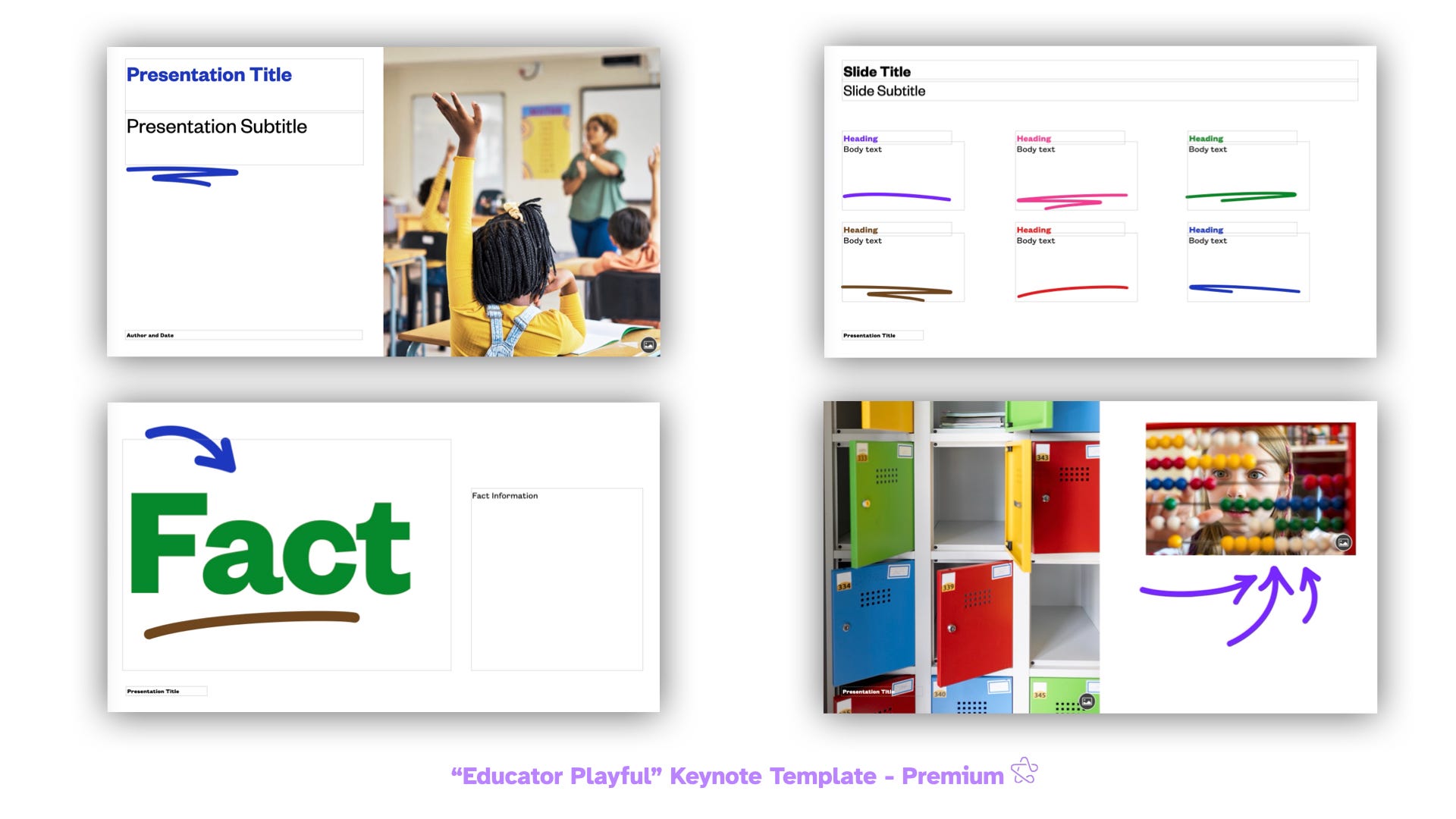
As you may know, PowerPoint is Not Pedagogy, but I do hold some selfish value on making presentations that are easy on the eyes and use the medium to display information in a dynamic way to augment a lesson. Keynote has always been good at this, but Canva has historically been even better. “Educator Playful”, one of seven premium education templates, is probably the closest to come to the Canva aesthetic. Clean arrows, colorful headings, and underlines galore, I think they look great, and pair well with the new Content Hub for Canva-level clip art and images. If there were even more playful, colorful, themed templates for educators with baked in graphics, it would be a great option. But for now, Canva’s diversity and openness to user-created designs is just too vast to pass up if that is something that is important to you. This is one of the largest critiques of Apple Creator Studio: Though useful looking on its face, it is clearly too shallow of an implementation to move the needle on anyone’s workflows.
Pages
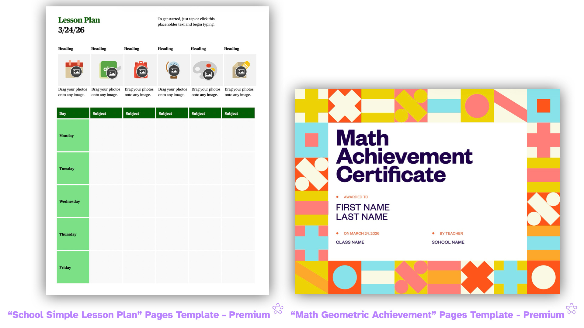
This leaves Pages. Similar to Numbers in terms of “diverse” offerings, what makes it even more frustrating is that many of these are clearly geared toward school teachers, who again are somehow not included in the bundle’s education discount. I am hard pressed to think of a college-level instructor who would use “School Simple Lesson Plan” as their planner, though education majors may get some use out it. The same goes for “Math Geometric Certificate.” Obviously this is designed for primary school students with its colors, graphics, and structure. Overlooking school teachers and students in this market is a large misstep in Apple’s product strategy, as well as the resources dedicated to developing these designs in the first place. Who will use them if not us?
There remains a vast an unexplored world with these templates, and if Apple really wants to make this suite more appealing for an annual subscription, they desperately need to up their game on templates. As of right now, Canva still reigns. You’re better off downloading a PowerPoint/Word file from there and uploading it back to Keynote or Pages. Annoying and cumbersome, so Apple should really look to fill this gap.
Is Apple Intelligence Any Good?
The entree in this new and improved lineup is its deeper integration with Apple Intelligence, which has had an infamously delayed and scattered rollout since its announcement all the way back in 2024. The hype for AI around knowledge work, especially academia, is palpable, but I think an important metric to judge these tools is through it’s rebuke of psuedo-productivity3 — We should either be accomplishing tasks faster at the same quality or obtaining a higher quality product for the same about of work.
Keynote got the most love in this update with similar crossover features to the other apps, so that is what I’ll focus on. Broadly, the update is composed of a handful of image generation features as well as two that are LLM focused, mainly utilizing ChatGPT under the hood. The generation limits are relatively generous, at 50 images, 50 presentations, and presenter notes from 700 slides, which resets each month. To play around and capture all the screenshots for this feature, I hit 25% of my monthly usage.
In classic Apple fashion, the menus here are highly accessible, with much of the prompting to ChatGPT happening completely behind the scenes without the user ever needing to see or write any verbose prompts, which I think works well. Many of the LLM features solely require the click of single button to produce a rapid response, which is paramount to building a solid workflow during a 45 minute planning period. Let’s see how much we can accomplish.
They’re Worth 1,000 Words
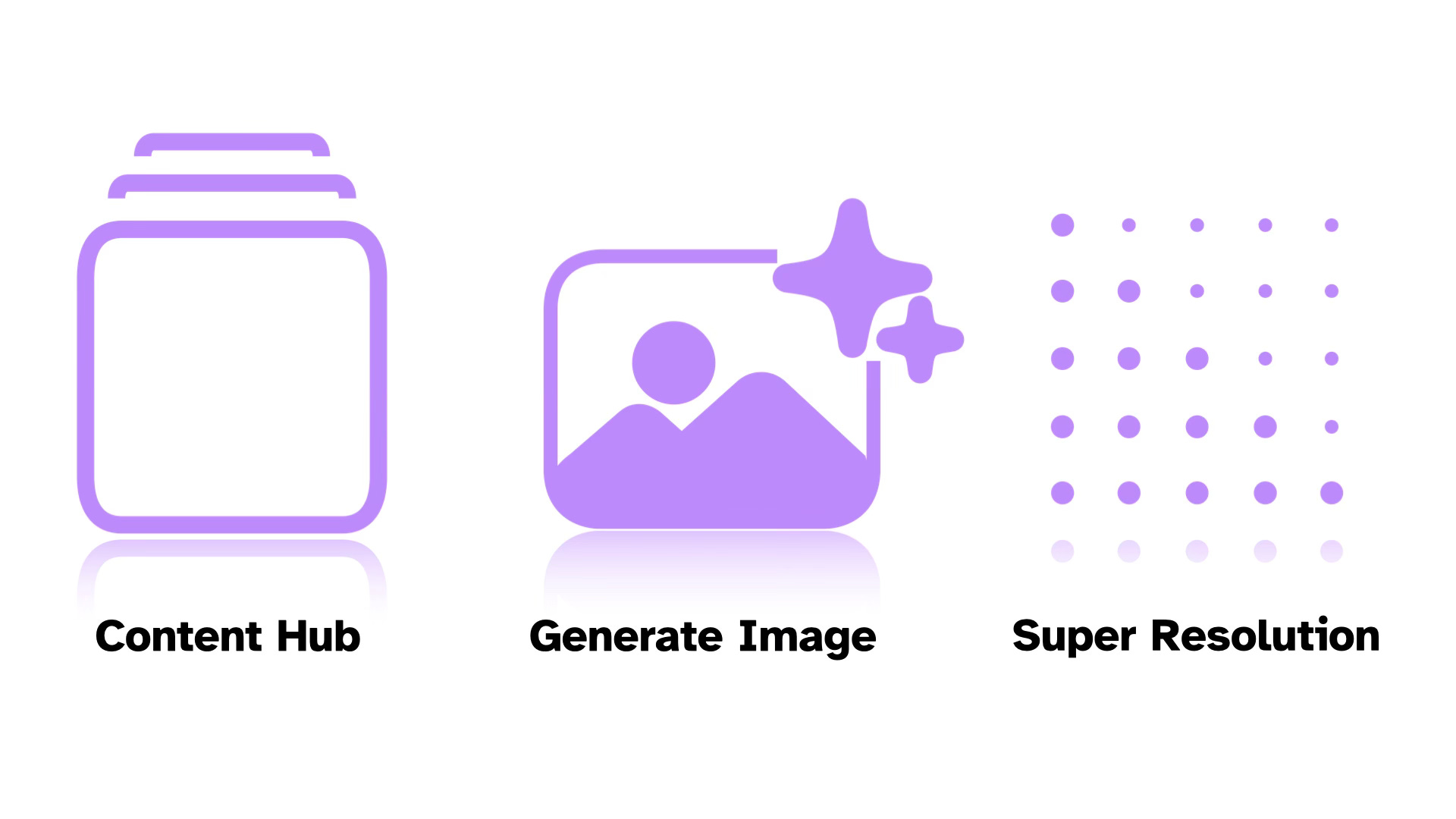
Images are the pride and joy of the ACS experience. Content Hub provides thousands images, graphics, and shapes to choose from without ever having to navigate to a browser or copy and paste. The flow here is simple and fast: You click on Content Hub, type what you want, click it, you blink, and it’s inserted into your slidedeck. The images are high quality, though painfully generic. Searching “Lincoln” yields a single picture of the Lincoln Memorial, some pennies4, and Mount Rushmore, among few others. A simple connection to public domain images through the National Archives would make a world of difference for this feature. For now, I still find myself jumping to a browser to prep.


Now, instead of searching the Content Hub, you could generate any image your imagination can whip up to support a classroom. This is obviously nothing new Apple is offering, and that trademark ChatGPT look is pungent. It’s certainly not ideal for anything that requires authenticity, accuracy, or artistic intent5, but for my language learner classroom, this is superb for making illustrations alongside on-screen instructions for our activities. The time saving is negligible when compared to stitching together clip art I suppose, but it is a different way to make a slideshow more appealing and saves me the time and bandwidth from going to a site to generate an image in the off chance I need one.
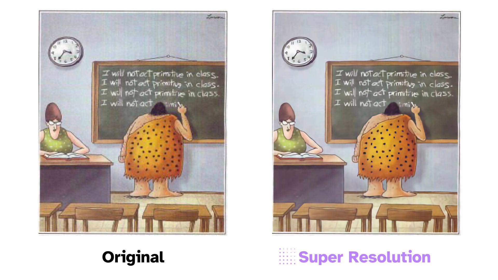
By far my most beloved feature is Super Resolution. The ability to take a low-quality image and upscale it for a presentation has haunted me since the beginning of my career. Visuals in any ESL class are pivotal to connect concepts to language, and so it’s devastating as a teacher to find the perfect image, only to find a low quality version that is difficult to parse when blown up onto a projector. Paste in an image you found online, click the Super Resolution button, and within seconds you will see it in higher quality. And the best part? This is an entirely local process happening entirely on your computer. No internet connection necessary. This is AI at its best: clean, fast, local, and saves a ton of time. The limits of this feature are apparent. It works better with simple images without a lot of detail, and around words it gets that AI fuzz, but it is serviceable, and is the most useful feature by far for images.
Don’t Try This At Home: The Madness of the Language Model
The weakest premium feature set by a long shot stems from the ceaseless, sycophantic vomiting of the large language model. There are two major features here to speak for: Generate Slides & Generate Presenter Notes. The features on their face may perk some critical ears. You may be thinking to yourself: If I am creating a presentation for a lesson, why in the world would I outsource the workload to AI, just to turn around and fix all of the things it created? To this I am completely confounded. In the same way that writing an essay requires your thoughts and judgement, so does a presentation. What to keep, what to add, what visuals to apply are skills that (for the foreseeable future) simply cannot be accomplished by a simple Generative AI application.
After playing around with this feature with my own descriptions and getting lackluster results, I decided to do what literally no teacher should ever do ever: Take a pre-made lesson plan (in this case, I took Digital Inquiry Group’s lesson on Castro and the US), paste it into the description dialogue box, and see what it comes out the other end. And it is under these laziest, malpractice-worthy, most detailed of conditions, that the cracks in this feature-set become evident.
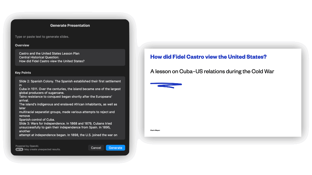
Take a look at the results for yourself. Slides are bare with some only having a title. There is no real formatting to speak, and not a single visual is present that did not come as default in the template. Sure it broke information into individual slides, but with such a vast library from the Content Hub, you would imagine that it could be easily paired with Generate Slides. It is a colossal oversight. Perhaps if you just wanted ChatGPT to automatically press the “Add a Slide” button for you ten times? Maybe if you just wanted to use the “Contents” slide it provides as an agenda? I simply see no reason for this feature to exist other than to tempt users to try outsourcing their thinking, and waste their time going over the information with a fine-toothed comb to ensure accuracy and fidelity if that is any priority of yours.
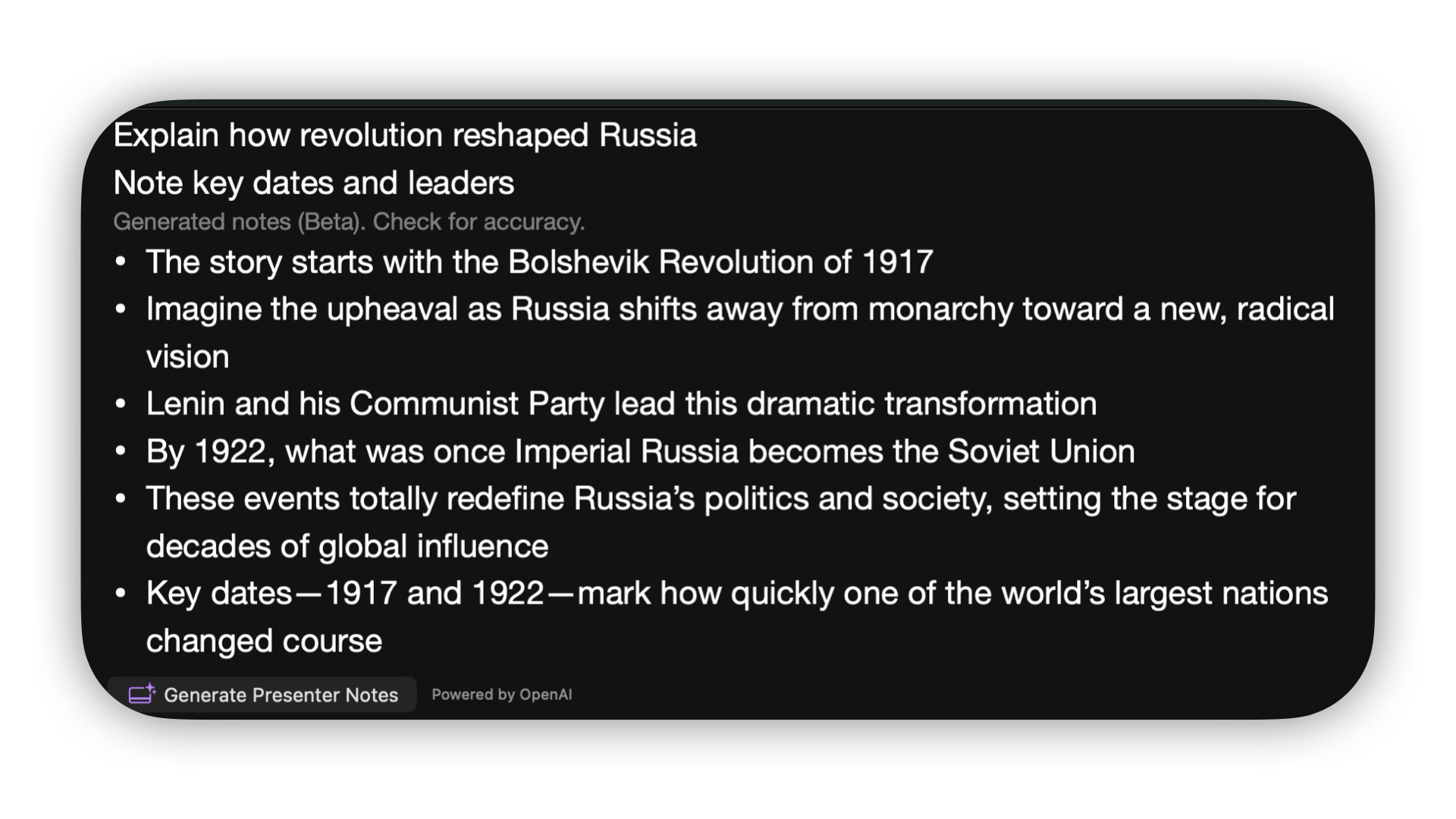
Generate Presenter Notes is more of the same: Taking guesses at what you want to say in a feeble attempt to shield you from using your brain, tricking you into believing you got more done. And that is the true problem with the incorporation of LLM’s into Keynote. These resolve nothing for a teacher’s workflow other than creating more noise to sift through. Am I really going to create a whole slidedeck just to read ChatGPT’s notes on it in front of an audience? Again, I beg the question: What is the point?
Any practitioner who uses either of these features would be forced to go back to each slide, edit text size, add images, and ensure that nothing was hallucinated, at which point you might as well have created your own slidedeck at the onset. Lucky for me, DIG’s outline for the lesson was detailed enough, and ChatGPT was conservative enough to produce a notes where no major hallucinations were formed. But is that really the objective? History teaching inherently involves storytelling6. The relationship between the US and Cuba is fascinating, intricate, and more relevant than ever, and the slides and presenter notes created simply cannot match the forethought, study, and delivery that a good instructor provides. It is the perfect example of AI for the sake of AI.
This is nothing new to the Big Tech, who has continually attempted to monetize AI by cramming in as many features as they can, useful or otherwise. But it is annoying that Apple is simply following suit.
Dreaming of Electric Sheep
Apple Creator Studio is a cavalcade of missed opportunities, with an agonizing breadth of potential that has not been realized. Here is my wishlist for future updates:
Styled, niche templates that solve more diverse problems for power users in a given field, and many of which are low-hanging fruit
Deeper data analysis sheets
Cornell Notes
Calendar designed for planning
Infographics
Syllabus
KWL guide
ADDIE guide
Vocabulary sheets
Progress trackers
Kanban Board
You get my point. If you have any other ideas, let me know.
Offer the Education Discount to all students and educators.
Expand Content Hub’s image offerings, providing access to Public Domain images and diagrams, and deeper integration to make recommendations for graphics
The addition of more image editing tools
Automatic mind maps in Freeform based on given input
Stop the LLM slop. It is garbage quality and no amount of extra GPUs, RAM, or water consumption can mend this
Honestly, I am looking forward to seeing what future updates look like. The world of Apple Intelligence has been chaos over the last 2 years, but with the implementation of a white-labelled Gemini serving as its Private Cloud Compute, the potential for our workflows to get faster and more efficient beckons. Only time will tell what we can continue to do with this technology moving forward.
See Steph Ango’s File over App
I found when writing this review that this discount is only for University students and staff! What a waste!
Lest ye be shoveling slop into your classroom
See Natalie Wexler and 4QM for more on this and the thinking routines involved in good history pedagogy.